| ||
| ||
| ||
| ||
| ||
| ||
| ||
| ||
| ||
| ||
| ||
| ||
|
Support  E-mail
© Copyright 2014 website2Go.com All Rights Reserved |
| Site Color |
You are here: Help Topics > Site Color
Site Color
Change your site's look with a single click
Site Color allows you to change the look of your website with a single button. This Site Manager tool gives you access to a wide range of website colors and backgrounds.
When you click on the Site Color button your browser will open a window with color scheme templates. Using the Preview button adjacent to each color scheme, you can preview what the new colors will look like on your website.
If you like the results, you press the Publish button and the new color scheme will be replicated for all your website pages.
The screen snapshots below show how to use this feature.
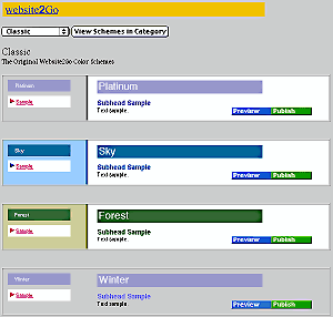
- When you click on Site Color your browser will open to the window shown above. The default setting for the color schemes will be "Classic."
- You will notice a button with the word Classic on it. This is a popout menu. Adjacent to this button is one marked View Schemes in Category.
- Because you are already in the Classic color scheme area, you don't have to click on the View Schemes in Category button, but simply have to scroll down the page to view all the color combinations in the Classic Scheme.
- A scheme is a combination of headline, subhead, and caption color combined with background color and highlight colors or patterns for the navitation bar and sidebar.
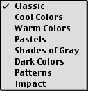
- However, if you click on the popout menu, you will get the following additional schemes.
- After selecting s color scheme, click on the View Schemes in Category button and you will get a new screen which displays the entire collection of colors in that scheme.
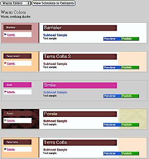
- Selecting Warm Colors and clicking on View Schemes in Category will bring up a screen like the one below.
- Feel free to try all the color schemes.
- After you found a color scheme you think you'd like to try, click on the Preview button to test that color scheme out on your web site. Look at some of your other website pages to make sure the scheme works as you had intended. If not, try another color scheme.
- Pressing Preview does not change your site, it merely changes what your browser is being sent while you are using the Site Manager Site Color tool.
- Once you have found a color scheme which you want to keep, press the Publish button and the changes will be made to your site.
- Once you press the Publish button, you should go through your website page by page just as one final verification that the new color scheme works as you had intended.
- If it doesn't, simply go back to the Site Manager and, using Site Color, change the color scheme back to what it was or continue to experiment until you find a scheme which works.
How to Choose a Color Scheme
In general, the color scheme of a website should be consistent with the contents of the site.
Classic colors are colors which look neutral but which present the contents with a great deal of clarity. Within the Classic color schemes are warm, cool, impact and patterned selections.
Cool Colors are the blues and greens. These colors are typically used with logical or technical material but aren't restricted to those categories. For instance, green is equally useful for environment, outdoors, active lifestyle and other activities like that. Blue is often used with water or electrical sites because of the color association between blue and ocean color or blue and lightning color.
Warm Colors are used to connote emotional empathy or other positive emotive feelings. It has been used for passion as well. Warm colors appeal to the heart while cool colors appeal to the head.
Pastels are used with arts and crafts as well as more sedate hobbies and pursuits. Pastels are non-intimidating and soothing, in contrast to Impact colors which are designed to attract and alert.
Shades of Gray are often used with businesses because of the truly neutral nature of gray. Gray neither solicits interest nor deters interest - it merely is. A site intended mostly for information dissemination purposes would be one where Shades of Gray schemes ought to be considered. On-line manuals and other reference material also benefit from these schemes.
Dark Colors are very powerful and draw one's interest inward. Sites which have a powerful message to convey can safely use these schemes without concern that the message will be misconstrued. Dark Colors can also be used to draw one's attention to something which might otherwise be ignored.
Patterns are akin to wallpaper. Although one can paint a wall a color and create a mood or solicit a reaction, wallpaper goes that one extra mile to enable one to sustain a mood with color but provide distinction in addition. Use the Patterns schemes for the same purpose. The patterns are in warm and cool colors but also provide a level of distinction not possible with just colors. Use this for sites which are somewhat unique to further distinguish the site from others.
Impact schemes are very powerful visually and make a strong statement. Sites which have a powerful message or contain powerful images can benefit from using this scheme. Sites representing a firm or organization whose creed is strong can also benefit from these schemes.
|
|
Click here to see an example guide to color scheme. The color schemes are being added to every day. We show the Classic color scheme and describe it. Use Site Color tool to see all of them. |
There have been thousands of pages of material written about the use of color to invoke mood or solicit interest or calm nerves. The US Military, NASA, the National Science Foundation Antarctic Program, Hospitals and Schools all are professional users of color to create proper background environments for their staff and associated visitors.
There are many online references to the use of color as well. Website2Go will be providing further information as well as links on the use of color in the very near future.
You are here: Help Topics > Site Color
Feature Overview
Site Color allows you to use one of website2Go's automated features.
By selecting from the various color schemes and clicking Preview you can see how the colors will look on your web site.
If you decide to keep that particular color scheme, use your browser "back" button to go back to the Site Color page or select Site Color from the Site Manager. Select the color scheme again and this time click on the Publish button.
Your web site will now have the new color scheme.
Popout menu
The popout menu gives you a choice of several different categories of color schemes.
The categories are:
Classic
Cool Colors
Warm Colors
Pastels
Shades of Gray
Dark Colors
Patterns
Impact
Once you select a category, click on the View Scheme in Category button to see all the color combinations in that scheme.
Select a Scheme
Use the popout menu and View Scheme.. button until you find a color combination which you would like to try.
Preview the Scheme
Within each color scheme are two buttons. The Preview button allows you to look at your website with the new color scheme without changing your website.
Use your browser "back" button to get back to the Site Color area, or, if you've gotten lost with a large number of page visits to preview your site, use the Site Manager to click again on Site Color.
Publish the Scheme
When you've found a color scheme which appeals or which is appropriate for your website, use the Publish button to make the color scheme the default color scheme for your site.
Remember, you can always use the Site Manager and Site Color again to change the color scheme if you change your mind or if another color combination would be more appropriate.