| ||
| ||
| ||
| ||
| ||
| ||
| ||
| ||
| ||
| ||
| ||
| ||
|
Support  E-mail
© Copyright 2014 website2Go.com All Rights Reserved |
| Color Scheme Guide/Classic |
You are here: Help Topics > Site Color > Color Scheme Guide/Classic
Color Scheme Guide
Classic Style
- The Classic color schemes are simple with a subtle visual punch. These schemes use color very sparingly and present most of the information on a white background with black text.
- Use one of the Classic styles and you can't go wrong. These colors and background schemes look good with nearly any business or organizational website.
- Warm colors, such as Earth, Fall or Barrister, accentuate a positive emotion or feel.
- Cool colors, such as Sky, Winter, Forest, accentuate a logical or straightforward emotion or feel.
- Impact colors, such as Upbeat, Floral, and Portfolio, accentuate a sharpness or distinctiveness.
- For more Cool, Warm and Impact colors, see either Site Color or the User Guide for Color Schemes

- The best way to test a color scheme is to go to the Site Manager and click on the Site Color button.
- Find a scheme which appeals or which you would like to try and click on the Preview button.
- Spend some time exploring your website with a variety of different schemes. Some schemes will highlight certain elements of your website more than others.
You are here: Help Topics > Site Color > Color Scheme Guide/Classic
Feature Overview
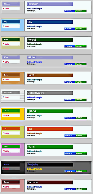
Platinum
This scheme uses a muted purple for headers and headline text with a gray background for the navigation bar.
Sky
Sky uses a light blue background for the navigation bar and a darker blue for the headers and headline text.
Forest
Forest uses a light olive navigation bar background with a forest green header color. Headlines are also forest green.
Winter
The difference between Winter and Platinum is in Winter the content area background is gray, in Platinum it's white.
Earth
The navigation bar background and headers are light brown. Headlines are a medium blue while the content background is white.
Conservative
The navigation bar in this scheme uses a lightly ruled background with grays. Headers are gray while headlines are medium blue. Content has a white background.
Upbeat
This scheme has a yellow background for the navigation bar and features bright green headers and headlines on a white background.
Fall
This scheme features a muted olive background with orange highlights for the navigation bar. The content area is white with orange headers and headlines.
Floral
This is one of the Impact schemes and uses a muted purple navigation bar background with muted green for headers. Headlines are medium blue on a white background
Portfolio
This is another Impact scheme. The background is dark gray for the navigation bar and light gray for the content. The headers feature blue text on black with orange headlines.
Barrister
This scheme features a muted maroon navigation bar background with a maroon-brown highlight for headers. Headlines are blue on a white background.