| ||
| ||
| ||
| ||
| ||
| ||
| ||
| ||
| ||
| ||
| ||
| ||
|
Support  E-mail
© Copyright 2014 website2Go.com All Rights Reserved |
| How to use Add Add Form |
You are here: Help Topics > Edit Website > Edit an existing template, site or page > How to use Add Add Form
Add Form
Form Editor Use and Description
The Form Builder allows you to build attractive custom online response forms with the same skills you use in the Editor. When a site visitor fills out a form, its contents are emailed to the address you provide when setting up the form. You may add as many separate forms to a page as you wish, and each one can respond to a different email address.
We do not recommend using a response form to collect credit card data for online sales, since the form is not encrypted for secure transmission over the Internet. Instead, consider upgrading your service to the webshop2Go e-commerce system, which includes a secure shopping cart and automatic posting of receipts to your merchant account.
Add Form Button and Use
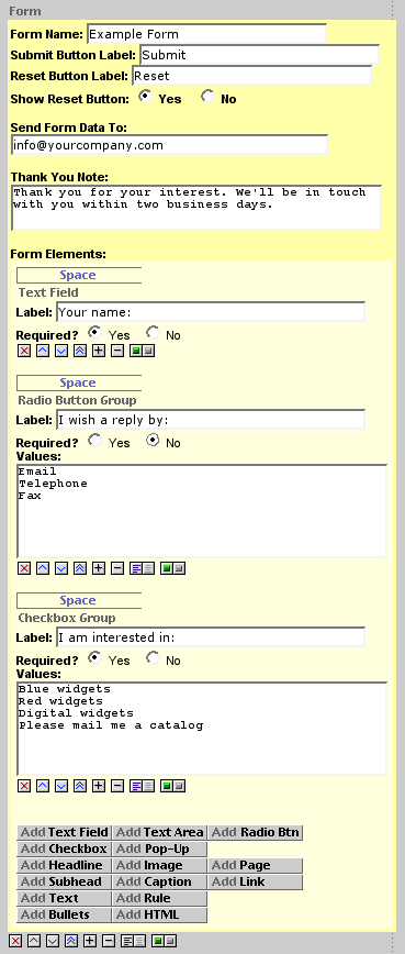
When you click the Add Form button, a new form section appears on your page in the Editor. Each form's elements and setup parameters are contained within a yellow box, to set them apart from the other page elements; the setup details are on a darker yellow at the top, with the elements and button cluster on pale yellow below. If you add more than one form to a page, each will have its own yellow box and its own button cluster.
Form elements are added in the same manner as page elements: by clicking on the appropriate button in the cluster at the bottom of the pale yellow box. Be careful not to confuse the form button cluster with the similar page button cluster at the bottom of the page (on the gray background).
The Form buttons add new elements only within that form, although you may intersperse form elements with text, headlines, bullets, etc., within the form area. A form text element, for example, cannot be moved outside the form area to elsewhere on the page; use the regular page element buttons to place page elements outside a of form. Each element has an initial default of one space (blank line) above; you may add or subtract space as you see fit.
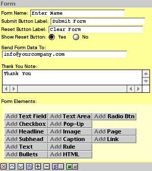
The setup section contains default values that will work, but you may change any of them to suit your needs. You will probably want to give the form a name, which will appear in the subject line of the email you receive. If you wish to change the text that appears on the Submit and Reset buttons, enter the new text here. You may also choose to dispense with the Reset button if you think it won't be useful to your visitors. Next, enter the email address to which you want the collected data sent. Finally, enter the Thank You Note text, which the visitor will see after submitting the form.
If the email address you specify above is one at your website2Go domain, you may also set up an auto-responder to send an email acknowledgment to the visitor.
Form Elements
To save screen space and reduce clutter, only element labels - and options, where applicable - appear in the Editor, not the elements themselves. Elements may be moved up or down, hidden or shown, space-above added or subtracted, and left- or center-justified using the same tools as normal page elements. Preview or publish the page to see how they look. Form elements are placed one element per line, in a vertical array. Labels are not required, but if you omit them, make sure each element's intent is clear to the visitor. The Form Builder will let you add all of the elements available in HTML, with a few limitations on their use:
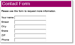
A one-line text entry element. Enter the desired label, which will appear in bold to the left of the blank field on the published page. Multiple contiguous text fields are automatically aligned vertically in two columns, one for the labels and one for the blanks. Limitation: no default text entry may be specified (it will always start out blank).
A text area is like a text field, but the visitor may type freely into a scrollable box. Limitation: no default text entry may be specified (it will always start out blank).
Use radio buttons for multiple-choice answers where only one choice is possible. Radio buttons are added in groups: if the visitor selects one button, all the others in the group will be deselected. List the choices in the values box below the label. Radio buttons are arranged in a vertical stack below the group label on the published page, with the button on the left, followed by its value. Limitation: no preselected option may be specified.
Use checkboxes for multiple-choice answers where more than one choice is possible. Each choice may be selected independently. Checkboxes are added in groups that share the same label. List the choices in the values box below the label. Checkboxes are arranged in a vertical stack below the group label on the published page, with the checkbox on the left, followed by its value. Limitation: no preselected option may be specified.
Also known as a drop-down or list box, a pop-up is another way to offer multiple choices, in a format that requires less screen space than a radio-button group. List the choices in the values box below the label. Note that the first line will be the text that appears by default on the published page; if you want the pop-up to appear blank, enter a single carriage return as the first value. Limitation: only one value may be selected by the visitor; if you need more, use a checkbox group instead.
Here are the length limits for various items in the Form Builder:
Form name: 30 characters
Receipient email address: 50 characters
Submit button label: 30 characters
Reset button label: 30 characters
Thank You Note: 65,535 characters
Form element label: 100 characters
Form element response: 65,535 characters
All of the other buttons in the cluster work identically to their page counterparts; see Edit Website for their descriptions and use.
Required Fields
Use the radio buttons to designate a field as "required." Required fields are marked with an asterisk (*) next to the field label.
If a required field is left blank when the form is submitted, the user will be reminded which field needs attention, and submission will not be permitted until all exceptions have been addressed.
This feature does not perform validation of the response. It only tests whether the field is empty.
Testing
We recommend that you test each form before making it live on your website. Before that point, you may find it useful to hide the page containing the form until testing is completed. If the response is to go to someone else, we suggest using your own email address in the Send Form Data To field until testing is successful, then changing the address to the final destination. To test a form, first publish the page, then complete the form as if you were a site visitor. Submit the form and check your email a few minutes later to make sure you're getting the responses, and to see what they look like. If you're planning to use an auto-responder to acknowledge form receipt, this is a good time to test that, too.
You are here: Help Topics > Edit Website > Edit an existing template, site or page > How to use Add Add Form
How to use Element Tools
Click this to kill the item.
Click on this to move an item further up on the page.
Click on this to move an item further down on the page.
Click on this to move the item to the top of the page.
Click on this to add space between the item and the one above it.
Click on this to remove space between the item and the one above it.
This is the text alignment tool. Click on the left button to align text to the left margin. Click on the right button to center the text.
The left side of the Show/Hide tool will show green if the element is visible. The right side will show red if the element is hidden. Click opposite to achieve opposite effect.